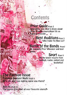
The first content page i have selected to annotate is very bold. The page itself is bold because you have different shades of a viberent pink making a bold statement. We know this is a magazine for girls becuase of the colour scheme.
There title of the page is very unclear and other parts of the text are bigger than the title. This makes the magazine look unreliable and a copy. The font is clear and easy to read but still stylish and attractive. But the colour and size would need changeing to make it more obvious that it is the title.
The othere information on te text is clear and have bold headings. Next to the main text there is a page number just like in all magazines this is to save time and pick out the key points to interest the reader. There are also never in order of the page the producer of this magazine has plased the information very well making it look neat and tidy. But stylish and attractive.
If i was to change anything on this content page i would change the title and make it bigger and bolder so people know what the page is about.
The second content page i have selected is also bold the producer has used the colours well as the background is plane but the colours of the image make the page bold. There are many colours in the silhouette of the person and the dog. He has selected a colour from the silhouette and used this in the font making the colours consistant and looking neat.
The title of the page is clear. The text is simple and attractive but still stands out. however the text below is slightly harder to read as the letter seem close together and bold making it harder to read. The pages have also been listed in order this makes the page look organised but i dont personally like this and most magazines dont list them in order. There is also a random image behind part of the text haking that section hard to read as the font and the image are both dark. The image also has no relevence to the magazine making it look unperfesional.
In my magazinee i think i may use the idea of a busy object and a plain background as the image really grabs the readers attention. however i would make sure everything is relevent. I would also muddle up the order of the page numbers and make sure all font is easy to read and sutable colours, fonts, and sizes.

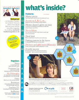
The third content page i have selected is very different from the others as the othere were more images, and this one has mostly text and educational images. The title of the page is clear and attractive. The bold colours of the text against the plain background makes the title stand out well.
In this content page there are only 3 colours that have beeen used, blue, white, and yellow. Thes colours stand out very well and attract the readers attention but not black and boring. On this page the producer has used the number of the pages in order. Most magazines wont do this because it isnt a list it is just advertising whats in the magazine.
There are a number of pictures in this image all being educational. The images catch you eye and stand out as there are not many images, however the images used are big and therefore dont need as many images. I like the idea of bigger images as then the page is not to crowed and busy with lots of images. But i would make the images more interesting and bold.
No comments:
Post a Comment