This is a content page belonging to Q. We know this because the logo is still in the left coner of the page. We also know it is a content page because of the masthead at the top of the page. There is also a large image covering the whole page. I dont know who this is an image of however we know he is somewhere in the music industry as it is the topic of the magazine. I believe this man was into rock because of the wild hair style, the dark colours, and the angry attitud on his face. The text is all to the left of the page the text is easy to read and stands out againt to background image. The producer have used about three colours also, red, black, and white. There is a lot of dark colours on this image giving of a negative vibe.The reader might want to find out about this man and see why he looks so angry and what he has to do with music. The text has been structure in a cronological order, giving the idea it is well structured and organised.
In this magazine the content page has a masthead covering the entire width of the page. The masthead is big and bold but not to big there is still a lot of space for information. They have used a Brocken font with sections of the lettering missing, this colour be representing what to find in the magazine or the style of music the magazine in about. The masthead is black a bold colour that stands out as there is only a small amount of black used on this page.
The producer has stuck to three colours making the page look neat and organised. (Red, white, and black). These colours are used quite a lot as all the colours stand out against one another and contrast well.
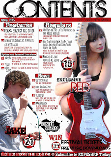
The layout of the page is busy as there is a lot of information and 2 large images. However the page has clear divisions of the text, by using bold subheadings and lines. Because of the lager amount of text we can see than magazine is targeted at a n older audience that top of the pops. This is because the older teenagers/young adults like to read in more detail than an average teenager. This is clear the content page belongs to a music magazine as the girl to the right of the images is holding a guitar. And the guy to the left of the image is singing into a microphone.
The information is quite hard to read although it stands out. If I were to change anything on this content page I would change the text so it is easy to read.
This content page belongs to a popular, teenage girl music magazine, Called top of the pops. We know this because of the layout of the page and also the small shot of the cover in the left side of the page. We know this magazine is targeted at teenage girls because of the childish feminine colours the producer has used. Pink is a stereotypical colour associated with girls.
The mast head is covering the entire width of the content page, making it clear to the reader what is inside. The text is very simple but at the same time effective. Text like this is more feminine because of the carves in the lettering, a man/boy would not usually right in this style also making it clear the magazine is targeted at girls. The text is white and against the bright pink background this stands out well and captures the audience.
There is a selection of images on this mage the main image being the front cover of the magazine explaining where to find the article in the magazine. There are also images carefully placed around the page linking to the article it represents. But using a number of images the makes the reader curious about the image and teenagers don’t always like reading long articles so by having a number of pictures and smaller text teenagers are automatically drawn in. There are also images of bands that are popular to teenage girls because of their appearance. Teenage girls may only by this magazine because of one 1direction being in the magazine, gaining sales witch is what the producers want.
The layout of the magazine is well organised as the columns are placed in a neat, and consistent order. There are a number of subheadings to the magazine and a brief description on the page and where you can find them in the magazine.
In this magazine the producer has used a lot of colours but the page still looks organised as the pink and yellow is consistent through the page and used in a number of different areas.
I believe it is easy to fid certain areas because the magazine has been well structured.


No comments:
Post a Comment