
Monday, 15 October 2012
my magazine evaluation
 My Magazine Evaluation.
How does your media produce represent a particual social group?
My magazine represents the social group my magazine is targeted at, because on my front cover i have an image of a college student enjoying life at college. The student is there to represent the fun times college has to offer and that its not just all heads down work, there is fun involved as well as high grades being achieved. We know this student is happy because of the expression on her face and the way she is looking at the camera. She is looking directly at the canera showing confidence in herself.
Who would the audience be for your media product?
My primary target audience of my magazine is college students. However the secondary audience is students who wish to go to college and Parents/ Carers. This way im advertising what the school has to offer, persuading people to go to bramcote college, and informing people of the fun events and latest updates.
How did you attrace/address your audience?
With the bold colours of the image and text my magazine stands out. However there are not to many colours that it becomes complicated and messy. I have stuck to 2 colour,(purple and green) because these colours look well together and i can use different shades to make certain parts of the text stand out more that others. I have also used a large image that is placed to the left side of the page. The image is bold as most of the background is green and Jess is wearing purple. There are a number of different fonts making the page appear more interesting and some less serious than others. On my magazine i have used many sell lines that would attract the audiences attention and making them want to read my magazine.
What kind of media institution might distribute youe media product and why?
What have you learnt about technologies from the process of the construction of your product?
In the making of my college magazine i have learnt things such as the sizing of the bar code, and editing the contrast of the image. I also learnt to take many images and not always pose for them because this way the look more natural. To edit my image and add text i used a website called http://pixlr.com/express/ i have used this website on a number of occasions and there for feel comfortable using it.
Monday, 1 October 2012
evaluation content page
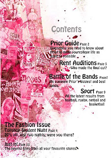
The first content page i have selected to annotate is very bold. The page itself is bold because you have different shades of a viberent pink making a bold statement. We know this is a magazine for girls becuase of the colour scheme.
There title of the page is very unclear and other parts of the text are bigger than the title. This makes the magazine look unreliable and a copy. The font is clear and easy to read but still stylish and attractive. But the colour and size would need changeing to make it more obvious that it is the title.
The othere information on te text is clear and have bold headings. Next to the main text there is a page number just like in all magazines this is to save time and pick out the key points to interest the reader. There are also never in order of the page the producer of this magazine has plased the information very well making it look neat and tidy. But stylish and attractive.
If i was to change anything on this content page i would change the title and make it bigger and bolder so people know what the page is about.

The second content page i have selected is also bold the producer has used the colours well as the background is plane but the colours of the image make the page bold. There are many colours in the silhouette of the person and the dog. He has selected a colour from the silhouette and used this in the font making the colours consistant and looking neat.
The title of the page is clear. The text is simple and attractive but still stands out. however the text below is slightly harder to read as the letter seem close together and bold making it harder to read. The pages have also been listed in order this makes the page look organised but i dont personally like this and most magazines dont list them in order. There is also a random image behind part of the text haking that section hard to read as the font and the image are both dark. The image also has no relevence to the magazine making it look unperfesional.
In my magazinee i think i may use the idea of a busy object and a plain background as the image really grabs the readers attention. however i would make sure everything is relevent. I would also muddle up the order of the page numbers and make sure all font is easy to read and sutable colours, fonts, and sizes.
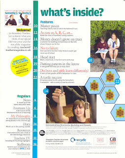
The third content page i have selected is very different from the others as the othere were more images, and this one has mostly text and educational images. The title of the page is clear and attractive. The bold colours of the text against the plain background makes the title stand out well.
In this content page there are only 3 colours that have beeen used, blue, white, and yellow. Thes colours stand out very well and attract the readers attention but not black and boring. On this page the producer has used the number of the pages in order. Most magazines wont do this because it isnt a list it is just advertising whats in the magazine.
There are a number of pictures in this image all being educational. The images catch you eye and stand out as there are not many images, however the images used are big and therefore dont need as many images. I like the idea of bigger images as then the page is not to crowed and busy with lots of images. But i would make the images more interesting and bold.
Tuesday, 25 September 2012
evaluation cover page

The magazine i have selected to annotate is called "College", indicating this magazine is aimed at teenagers who are perhaps starting or thinking about college. The mast head of the magazine is slightly covered by the girls head, meaning it is a well know or confident magazine company. The text is simple as to much can be hard to understand. The colour is bold making it clear it is the title and what it is about. The yellow of the title could be representing getting ready for college. The magazine is quite feminine with the colours and the woman being the main image.
The main image is of a young woman who looks sophisticated the outfit she is wearing is also casual like some college uniform. The woman is looking directly at the camera showing confidence for a new year.
There is a bar code on the front right hand corner showing the magazine is a reliable source and not fake. However there is no clear indication of a price.
On this magazine the producers have only used four colours including blue, green, white, and yellow. I think these colours work well together as the yellow stands out a lot against the Green background. They are all bold colours but the page is not to much colour, the produces has used the colours well and the don't clash with the image.
There are many sell lines surrounding the image all about college life. Things people may be worrying about or things that will help the become more successful with the college life. Another way we can tell the magazine is aimed for students. The producer have also not used any direct address also giving off a sense of confidence.
The layout of the magazine is pretty simple as most magazines have this basic layout. Main image and information surrounding it. This suggest it is aimed at a young audience because younger people arn't that interested it how unique and different the cover is as long a sit is appealing to them (images).

My second magazine ik have selecxted to anotate is also called "College" indicating this magazine is aimed at teenages who are perhapsstarting or thinking about college. The mast head of the magazine is slightly covered by the boys head, meaning it is a well know or confident magazine company. The text is a simple font and easy to read. The colour is bold making it clear it uis the title and what it is about. The greenish olive colour of the title is quite masculine aiming the magazine more to boys.
The main image is of a young man. In this image he is looking sophisticated and smart. We can also tell this boy is in education because of the study books he is carrying under his arm. The image is very dark and doesnt stand out much. To make it stand out i would suggest using a different background colour.
There is a bar code on the front left hand corner showing the magazine is a reliable source and not fake. However the bar code is on an angle suggesting is not serious, But the consistant use of the text make it look more appealing. And again there is noclear indication of a price.
On this magazine the producer has used three colours including olive/green, black, and white. i think these colours work really well together they are no in you face and to bright but stand out and grab the audiences attention. There is also a splash of pink witch you amediatly look at as it is not a consistent colour.
Again there are many sell lines surrounding the image about things that happen at college. The produces has not used any type of direct address on the cover because with the bold colours there is not much need to. However the colours of the text can become unclear on sertain areas againt the background image. But the fot is simple so still easy to read at smaller sizes.
The layout of the magazine is again the basics but just as appealing to teenagers.

The third magazine i hae selected to anotate is again called "College". Clearly stating the magazine is for college students. The mast head is a bold red witch makes it stand out really well. But the colour hasnt been ramdomly selected. The producer has also used the coloue red in the uniform the young woman is wearing. The text is simple making it easy to read and even though the womans head is covering the mash head we still understand what it is suppose to say.
The central image is of a teenage girl. The clothing she is wearing stands out well as the background is green.
They have also used a short septh of filed on this image to make the girl stand out even more. The girl looks smart but casual this could be showing schools not just all about what you wear. However there is no clear indication this girl is in college.
There is a bar code on the bottom right hand corner showing the magazine is reliable sourse and not false. There is also a blue strip on the side of the side of the bar code showing the price.
on this magazine the producer has used four main colours. Black, Red, Blue and Green these colours work well together and they stand out against one another. The colours are consistent making the magazine look more profecional. However if i was to change anything on this magazine i would make the girl slightly bigger and have less green on the background.
As on all magazines there are many sell lines trying to attract the audience. This magazine referse to college as this is the topic the producers have chosen.The magazine has not used direct address and i would personally make some of the text bigger as it doesnt stand out well and quite small.
On this magazine the producer has used three colours including olive/green, black, and white. i think these colours work really well together they are no in you face and to bright but stand out and grab the audiences attention. There is also a splash of pink witch you amediatly look at as it is not a consistent colour.
Again there are many sell lines surrounding the image about things that happen at college. The produces has not used any type of direct address on the cover because with the bold colours there is not much need to. However the colours of the text can become unclear on sertain areas againt the background image. But the fot is simple so still easy to read at smaller sizes.
The layout of the magazine is again the basics but just as appealing to teenagers.
The third magazine i hae selected to anotate is again called "College". Clearly stating the magazine is for college students. The mast head is a bold red witch makes it stand out really well. But the colour hasnt been ramdomly selected. The producer has also used the coloue red in the uniform the young woman is wearing. The text is simple making it easy to read and even though the womans head is covering the mash head we still understand what it is suppose to say.
The central image is of a teenage girl. The clothing she is wearing stands out well as the background is green.
They have also used a short septh of filed on this image to make the girl stand out even more. The girl looks smart but casual this could be showing schools not just all about what you wear. However there is no clear indication this girl is in college.
There is a bar code on the bottom right hand corner showing the magazine is reliable sourse and not false. There is also a blue strip on the side of the side of the bar code showing the price.
on this magazine the producer has used four main colours. Black, Red, Blue and Green these colours work well together and they stand out against one another. The colours are consistent making the magazine look more profecional. However if i was to change anything on this magazine i would make the girl slightly bigger and have less green on the background.
As on all magazines there are many sell lines trying to attract the audience. This magazine referse to college as this is the topic the producers have chosen.The magazine has not used direct address and i would personally make some of the text bigger as it doesnt stand out well and quite small.
Monday, 17 September 2012
All About Me
ALL ABOUT MEEEE!!!
My name is Katie Stark. I am 16 years old and curently attend Bramcote Hills 6th Form. I have taken 3 subjects including art, media, and photography. I have chosen these subjects because i love to be creating and use my imagination.For media my first task is to product and research music magazines towards the end of the tast i will have to product a cover page, title page and a content page. I have until november to finish the tast. I am excited to see my result of my work and see how close i can get it to a real music magazine.
Subscribe to:
Posts (Atom)